0→1
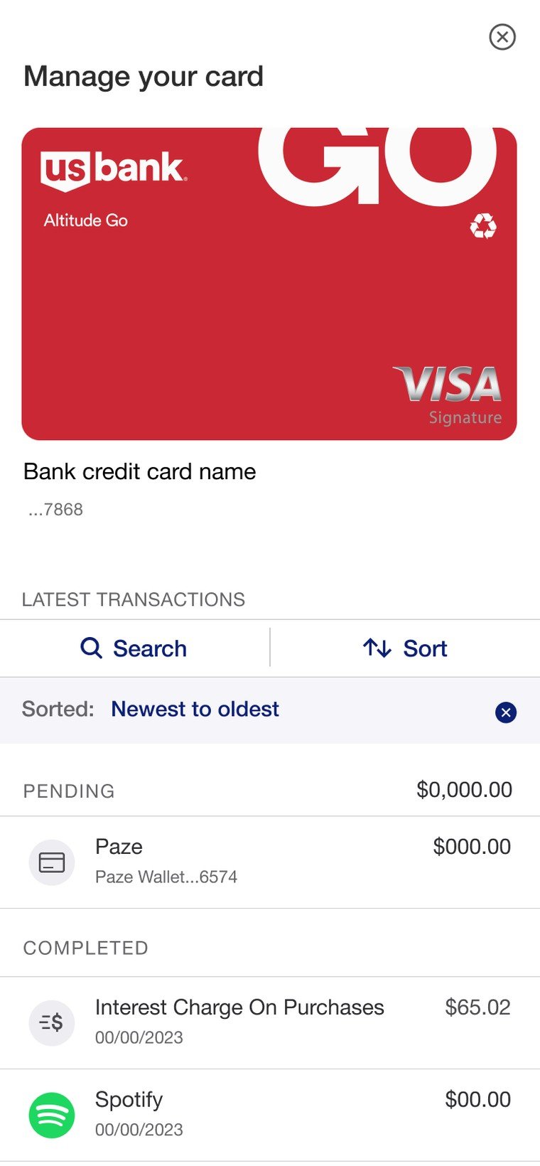
first unified Paze transaction view
By date·Merchant·Amount
Paze teal primary action
Ink amounts & labels
Muted dates & meta
Flag needs review
3
concepts explored, one shipped
People enrolled a stack of credit cards in Paze, then had no single place to see where, when and how much they'd spent. One unified history — for the power user and the once-a-month checker alike.
Paze let people check out online with any of their enrolled credit cards. But once the payment cleared, the trail went cold — transactions made through the wallet couldn't be told apart from ordinary card activity, and there was no way to answer a simple question: what did I actually spend with Paze?
Switching between cards to hunt for a charge was slow and disjointed. Without filters by date, merchant or amount, spending patterns stayed invisible.
How might we show users the transactions made with Paze wallet?
I ran a structured design-thinking sprint in Mural to move from ambiguity to clarity fast. We anchored on the How-Might-We statement, then a Crazy 4s round — four sketches, four minutes each — forced divergent thinking before anyone fell in love with a screen. Voting surfaced the shared values: clarity, speed, and minimal navigation overhead.
Three sketches grew into high-fidelity directions, each built on a different navigation mental model. We judged them on discoverability, cognitive load and implementation cost.
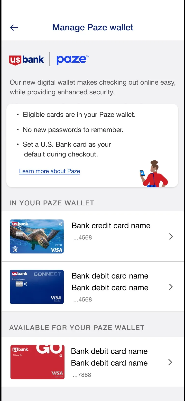
The winning direction kept all cards visible and let the history live one tap away — depth without a maze. Filters turned a flat feed into something you could actually reason about, and the pattern set the template for how transaction detail gets shown across the wallet.
One wallet, many cards — one honest history.