2019
pioneered — Citi's first design system
Aa
Raleway · 68/76 → 12/18
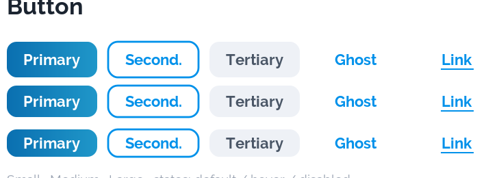
Buttons
Primary
Secondary
0 → 1
a styling kit became the standard
The first shared design language at Citi — colour and type tokens, a reusable component library, and the governance to make it stick.
Across Citi, product teams were shipping interfaces that looked and behaved differently in every app. No shared components, no tokens, no single source of truth — so consistency was impossible to enforce, and every new screen started from scratch.
The opportunity was to build the thing that didn't exist yet: one language every Citi product could speak.
Could one system speak for every Citi product?
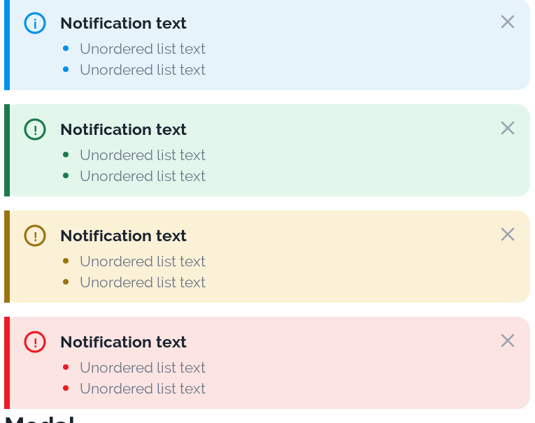
I pioneered Citi's first design system. It started as a styling kit — colour, type, spacing — and grew into a full component library with the governance model teams needed to actually adopt it.
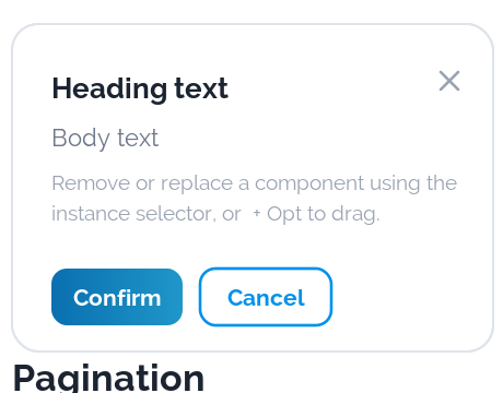
Tokens gave every team the same foundation. A documented component sheet meant buttons, inputs, tables and modals behaved identically everywhere. And a lightweight governance process kept it consistent as it scaled.
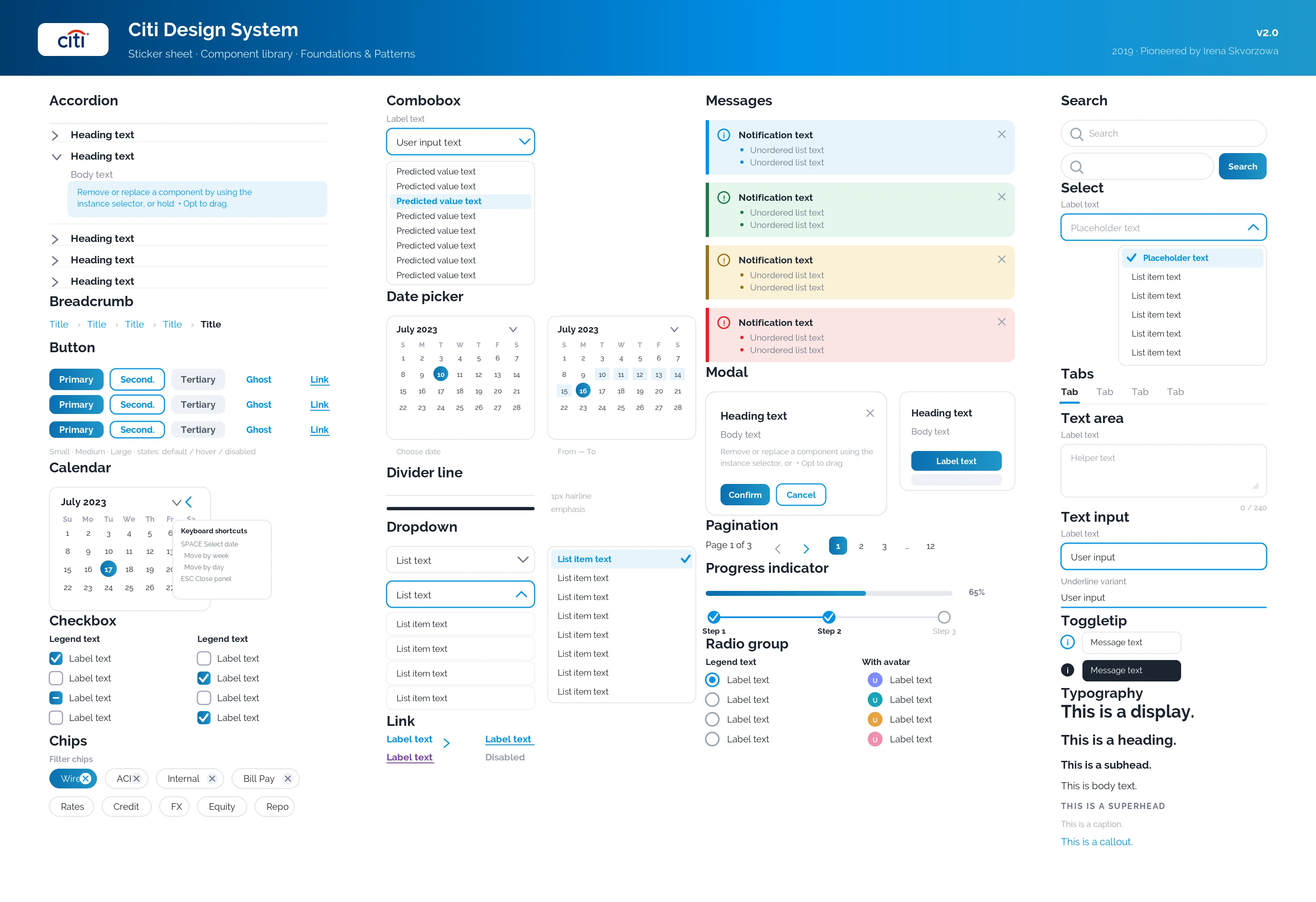
A shared language: consistent UI across product streams, faster delivery, and a foundation that outlived the project. Every Citi application that followed built on it.
A styling kit became the standard.